


Subscription business, as its definition suggests, is based on a long-lasting relationship between you and your customers. Maintaining this relationship is then crucial for the increase of your revenue and your company’s successive growth. It is also no secret that acquiring new customers is much more costly than keeping the existing customer base. Putting all of this together, it becomes obvious why retention is one of the most significant metrics that you must regularly monitor.
Retention report indicates how much of a certain asset (customers, subscriptions, MRR) remained active over time.
Here you can see that retention of new users was the lowest for those who signed up in March and April 2018.
Retention Report – Components
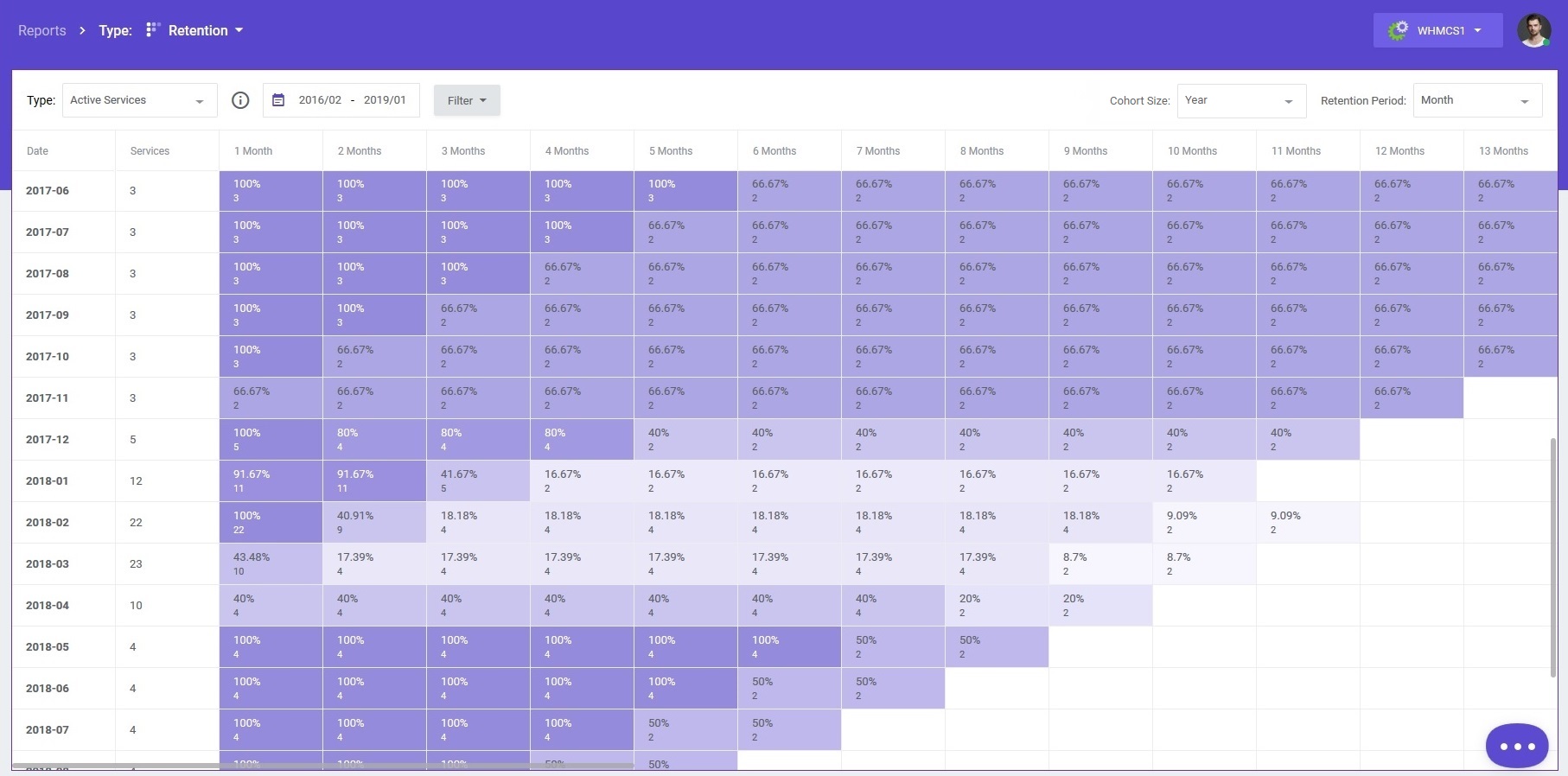
In most cases, retention is displayed in the table form consisting of multiple rows and columns. Each row starts with the so-called “cohort” – the starting period from which all values are calculated. With that in mind, you can read the report from two different perspectives.
By studying the columns you will find out how much of a given asset was retained within each of the cohorts after some time. While looking at the rows, in turn, you will immediately notice how big a percentage of the same asset was retained over time when compared to the initial value.
To make the changes between different time periods and cohorts much more visible for the user, cell colors vary according to the percentage of retained assets. The more intense the hue, the higher the number of the given asset. And the other way round – the more faint the color, the lower the results.
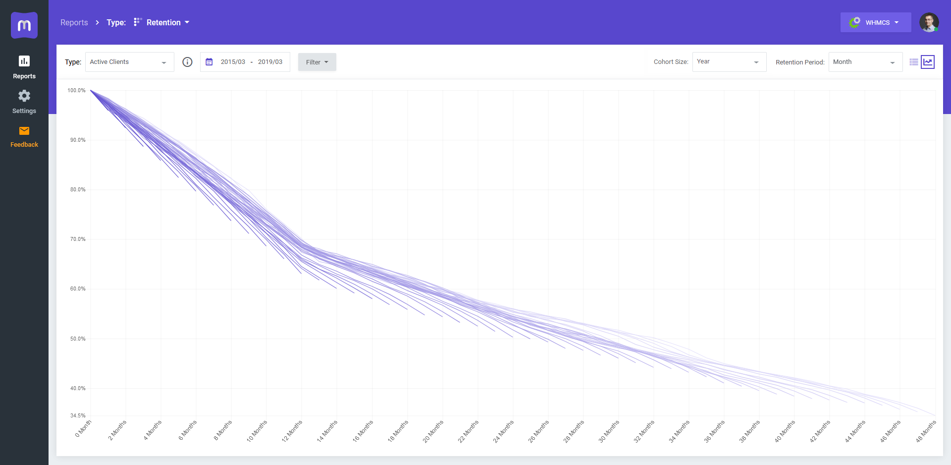
In some tools, MetricsCube included, retention can be additionally shown in a graph form which makes it even easier to notice bigger retention differences as well as the general tendency.
Interpreting Retention Report
I know this all may sound a little bit confusing if this is your first close encounter with the retention report. But don’t worry. Everything will make perfect sense once we have gone through a few practical examples.
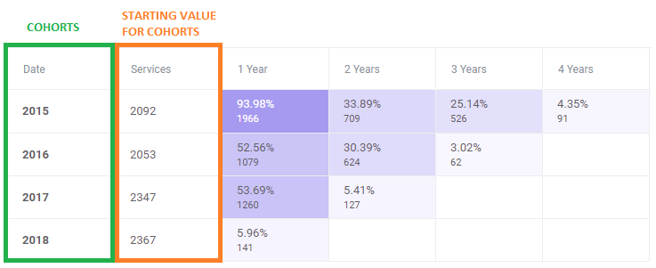
So, what can we learn from studying the first row of this report?
- The number of new services ordered in 2015 equaled to 2092.
- After a year, 1966 (almost 94%) of these services were still active which means that a lot of them were renewed for the next period.
- After two years, only 709 subscriptions (roughly above 33%) remained active so the number of renewed services dropped by more than a half when compared to the first year.
Let’s now move on to the second row:
- There were 2053 services ordered in 2016 (slightly less than in 2015).
- Unfortunately, only 52% of them were still active after a year, and after 3 years this value dramatically decreased to as little as 3%.
Imagine the above chart reflects your company’s retention. Even from this sample statistics you can draw some pretty compelling conclusions. Like for example the fact that the drop of service renewals in 2016 might have been a partial result of something you did back in 2015. Perhaps it was a radical change of pricing model that clients were not very enthusiastic about? Or maybe they abandoned your company for the competition?
I hope that this brief simulation allowed you to better understand the idea behind retention reports as well as learn how to benefit from them in real life.
Retention Reports Configuration
Apart from switching between two alternative retention report views, in MetricsCube you can customize some other settings as well to achieve the results which interest you the most at the moment.
-
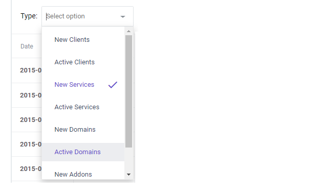
- Report Type – you can preview retention for users, subscriptions and MRR separately, from two different angles: taking into consideration active assets, or the new ones only. I will explain this distinction more thoroughly in the further part of the article so stay tuned!
-
- Datepicker – using this practical functionality you can easily define the time period for which the data will be presented. The chosen interval will include not only the cohorts but also the retention time (the number of columns).

- Time frames – The report can be displayed according to different time frames, that is:
- Cohort size – the longer the set cohort time frames, the less rows will be visible on the report
- Retention periods – the longer the retention period time frames, the less columns will be visible on the report
![]()
With the above configuration the report will indicate how successful you were in retaining customers who signed up within a particular year, after 12 months. For example, how many users who joined in 2017 were still active in 2018.
Retention Report Types in MetricsCube
As the definition suggests, retention report may involve any type of assets that can be measured, and does not have to be limited to subscriptions or customer retention only. This means that depending on the company you are running or the kind of data you are collecting, there can be at least several different “retentions” to monitor.
Now, as I promised earlier, I would like to tell you some more about the reports available in MetricsCube. There are as many as eight retention report types to be exact:
- New Clients – clients who just started their first recurring subscription within the set time frame
- Active Clients – clients with at least one active recurring subscription within the set time frame
- New Services – total number of new recurring services purchased by clients within the set time frame
- Active Services – total number of active recurring services within the set time frame
- New Domains – all new domains ordered by clients within the set time frame
- Active Domains – all active domains owned by clients within the set time frame
- New Addons – new recurring addons obtained by clients within the set time frame
- Active Addons – all active recurring addons within the set time frame
Summing up, personally I strongly believe that retention reports can be so much more than just a quick way to evaluate user loyalty over time. I wanted to provide all like-minded entrepreneurs with a sharp insight into when and where their retention starts to decline so that the required countermeasures could be taken as soon as possible. I truly hope that through multiple report types and configurations offered by MetricsCube, this vital metric of every subscription business will no longer have any secrets from you. Be sure to drop me some feedback if you want to hear more about this, or any other topic related to Business Analytics!
